Overview
This script shows one example PBMC10k: CD8 effector cell type to
generate figure 2 in the manuscript.
It also shows supplementary plots associated with figure 2.
Same script can be used to generate plots for other datasets or by
directly using simPICcompare function
Load data
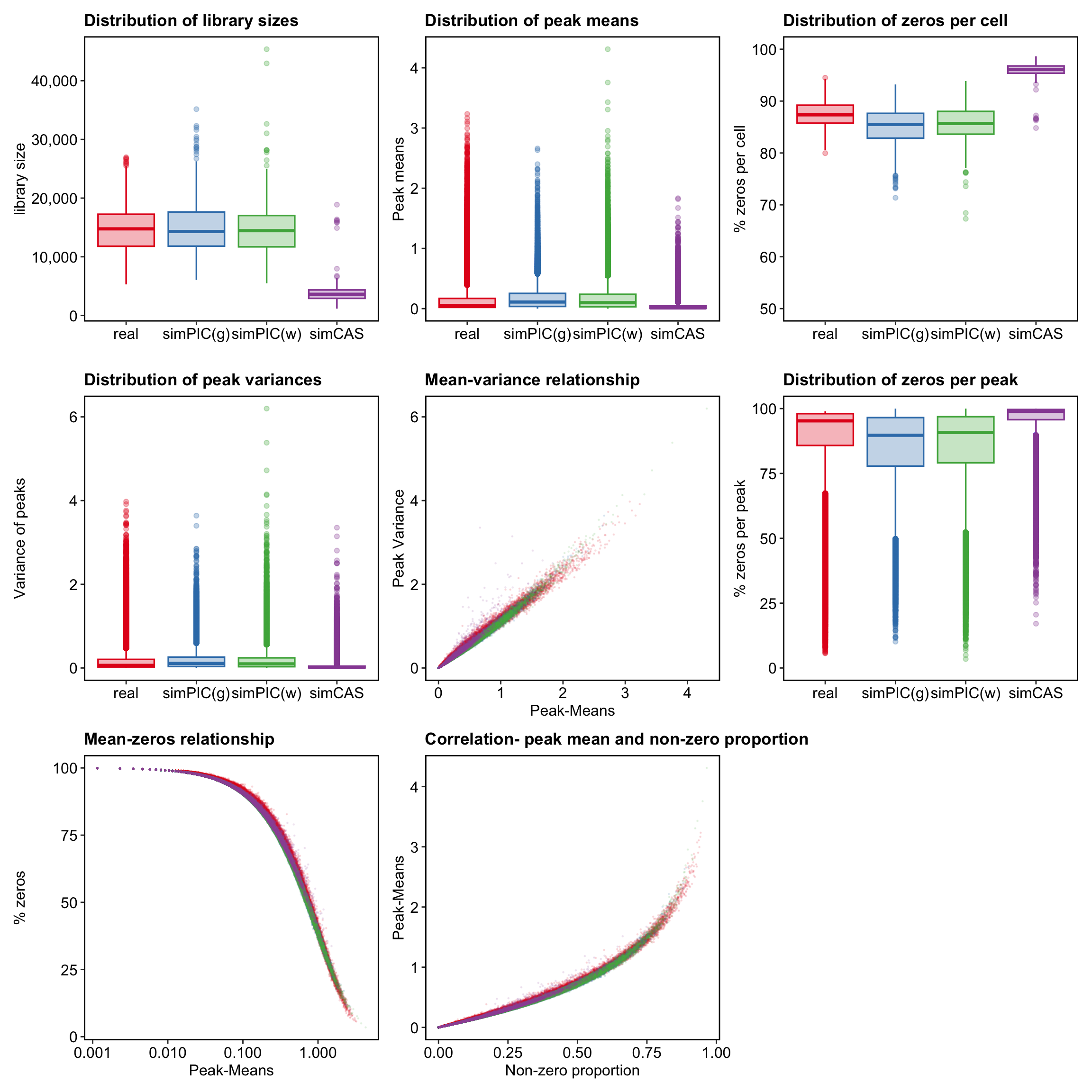
Loading example data form PBMC10k
Show code
p <- readRDS("../data/Figure2/pbmc10k_cd8effector.rds")Setting plot aesthetics
Show code
features <- p$Plots$Means$data
cells <- p$Plots$LibrarySizes$data

point.size = 0.2
point.alpha = 0.1

colours <- c(
  "#E41A1C", "#377EB8", "#4DAF4A", "#984EA3",
  "#008080", "#FFA07A", "#7B68EE", "#9ACD32", "black"
)
Show code
plot_theme <- function() {
  ggplot2::theme(
    axis.text = ggplot2::element_text(size = 12, colour = "black"),
    axis.title = ggplot2::element_text(size = 12),
    panel.grid = ggplot2::element_blank(),
    panel.border = ggplot2::element_rect(
      color = "black", fill = NA,
      size = 1
    ),
    panel.background = ggplot2::element_blank(),
    plot.background = ggplot2::element_blank(),
    plot.title = ggplot2::element_text(face = "bold", color = "black"),
    legend.position = "none"
  )
}


libs <- ggplot2::ggplot(
  cells,
  ggplot2::aes(
    x = .data$Dataset, y = .data$sum, colour = .data$Dataset,
    fill = .data$Dataset
  )
) +
  ggplot2::geom_boxplot(
    width = 0.8, size = 0.6, alpha = 0.3,
    position = ggplot2::position_dodge2(0.5)
  ) +
  ggplot2::scale_y_continuous(labels = scales::comma) +
  ggplot2::scale_colour_manual(values = colours) +
  ggplot2::scale_fill_manual(values = colours) +
  ggplot2::xlab("") +
  ggplot2::ylab("library size") +
  ggplot2::ggtitle("Distribution of library sizes") +
  plot_theme()

z.cell <- ggplot2::ggplot(
  cells,
  ggplot2::aes(
    x = .data$Dataset, y = .data$PctZero,
    colour = .data$Dataset, fill = .data$Dataset
  )
) +
  ggplot2::geom_boxplot(
    width = 0.8, size = 0.6, alpha = 0.3,
    position = ggplot2::position_dodge2(0.5)
  ) +
  ggplot2::ylim(50, quantile(features$PctZero, 1)) +
  ggplot2::scale_colour_manual(values = colours) +
  ggplot2::scale_fill_manual(values = colours) +
  ggplot2::xlab("") +
  ggplot2::ylab("% zeros per cell") +
  ggplot2::ggtitle("Distribution of zeros per cell") +
  plot_theme()


means <- ggplot2::ggplot(
        features,
        ggplot2::aes(
            x = .data$Dataset, y = .data$mean,
            colour = .data$Dataset, fill = .data$Dataset
        )
    ) +
        ggplot2::geom_boxplot(
            width = 0.8, size = 0.6, alpha = 0.3,
            position = ggplot2::position_dodge2(0.5)
        ) +
        ggplot2::scale_colour_manual(values = colours) +
        ggplot2::scale_fill_manual(values = colours) +
        ggplot2::xlab("") +
        ggplot2::ylab("Peak means") +
        ggplot2::ggtitle("Distribution of peak means") +
        plot_theme()

vars <- ggplot2::ggplot(
  features,
  ggplot2::aes(
    x = .data$Dataset, y = .data$VarCounts,
    colour = .data$Dataset, fill = .data$Dataset
  )
) +
  ggplot2::geom_boxplot(
    width = 0.8, size = 0.6, alpha = 0.3,
    position = ggplot2::position_dodge2(0.5)
  ) +
  ggplot2::scale_colour_manual(values = colours) +
  ggplot2::scale_fill_manual(values = colours) +
  ggplot2::xlab("") +
  ggplot2::ylab("Variance of peaks") +
  ggplot2::ggtitle("Distribution of peak variances") +
  plot_theme()

mean.var <- ggplot2::ggplot(
  features,
  ggplot2::aes(
    x = .data$mean, y = .data$VarCounts,
    fill = .data$Dataset, color = .data$Dataset
  )
) +
  ggplot2::geom_point(size = point.size, alpha = point.alpha) +
  ggplot2::scale_colour_manual(values = colours) +
  ggplot2::scale_fill_manual(values = colours) +
  ggplot2::xlab("Peak-Means") +
  ggplot2::ylab("Peak Variance") +
  ggplot2::ggtitle("Mean-variance relationship") +
  plot_theme()

z.peak <- ggplot2::ggplot(
  features,
  ggplot2::aes(
    x = .data$Dataset, y = .data$PctZero,
    color = .data$Dataset, fill = .data$Dataset
  )
) +
  ggplot2::geom_boxplot(
    width = 0.8, size = 0.6, alpha = 0.3,
    position = ggplot2::position_dodge2(0.5)
  ) +
  ggplot2::scale_y_continuous(limits = c(0, 100)) +
  ggplot2::scale_colour_manual(values = colours) +
  ggplot2::scale_fill_manual(values = colours) +
  ggplot2::xlab("") +
  ggplot2::ylab("% zeros per peak") +
  ggplot2::ggtitle("Distribution of zeros per peak") +
  plot_theme()

mean.zeros <- ggplot2::ggplot(
  features,
  ggplot2::aes(
    x = .data$mean, y = .data$PctZero,
    color = .data$Dataset, fill = .data$Dataset
  )
) +
  ggplot2::geom_point(size = point.size, alpha = point.alpha) +
  ggplot2::scale_x_log10(labels = scales::comma) +
  ggplot2::scale_colour_manual(values = colours) +
  ggplot2::scale_fill_manual(values = colours) +
  ggplot2::xlab("Peak-Means") +
  ggplot2::ylab("% zeros") +
  ggplot2::ggtitle("Mean-zeros relationship") +
  plot_theme()

pm.nzp <- ggplot2::ggplot(
  features,
  ggplot2::aes(
    x = .data$nzp, y = .data$mean,
    fill = .data$Dataset, color = .data$Dataset
  )
) +
  ggplot2::geom_point(size = point.size, alpha = point.alpha) +
  ggplot2::scale_colour_manual(values = colours) +
  ggplot2::scale_fill_manual(values = colours) +
  ggplot2::xlab("Non-zero proportion") +
  ggplot2::ylab("Peak-Means") +
  ggplot2::ggtitle("Correlation- peak mean and non-zero proportion") +
  plot_theme()
Generating Figure 2
First row is used as main figure 2
Show code
Plots = list( LibrarySizes =
libs, Means = means, ZerosCell = z.cell, Variances = vars, MeanVar =
mean.var, ZerosPeak = z.peak, MeanZeros = mean.zeros, PeakMeanNzp =
pm.nzp )

wrap_plots(Plots)